
Bloom x
Supple Foods
Bloom x Supple Foods
We Focused On Clean Design, Quiet Confidence, And A Voice That Built Trust Without Trying Too Hard. The First Draft Hit Home—They Loved It Instantly.
Branding
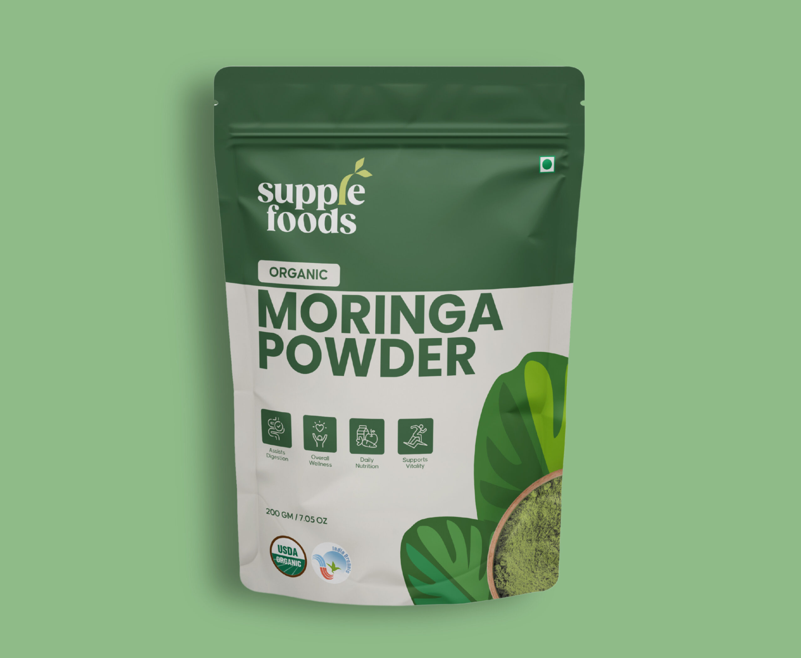
We wanted the logo to feel like the brand—rooted in nature, but with a polished ease. The green tones spoke of freshness and honesty, while the leaf element tied it back to their core: clean, conscious ingredients. The font had a softness to it, with just enough structure to say premium without being loud.
It didn’t try too hard—and that’s exactly why it worked.
Packaging
The first design landed perfectly. It captured the simplicity and quiet elegance they were aiming for. From there, we built out the remaining ten variations, each one aligned with the core look and feel. It set a consistent visual tone across the range just like they wanted.
Conclusion
This project was a reminder that even the most familiar ideas can feel new with the right design language. SuppleFoods trusted us to strike that balance—and we did, together. From colours to copy, every element was crafted with intention. It was honest work, and it felt just right.
More Projects